Configuring Table Columns
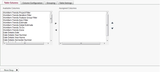
The first step of the table wizard is to select the columns to be used in the display table.
To select columns for the table:
- Click on the Table Columns tab.

- Select one or more Available Columns and then click
to add the column(s) to the Assigned Columns list-box. Hold the CTRL key down to select multiple columns.
- From the Assigned Columns list-box, change a column's initial display order by clicking on either the
or
icon to move the row up or down. Hold the CTRL key down to select multiple columns.
- If a column(s) in the Assigned Columns list-box is not desired, select one or more Assigned Columns and then click ![Shift left]
to remove the column(s) from the Assigned Columns list-box. Hold the CTRL key down to select multiple columns.
- When done assigning and arranging columns, either click the Next Step button or the Column Configuration tab to begin formatting the appearance of each column.
Note: At least one data column should be selected before continuing.
To configure and delete columns in the table:
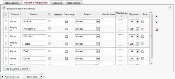
After having added columns, a column's order of appearance, display characteristics and summary information may be defined on the Column Configuration tab.

Initially only the Column, Header and Sortable columns are shown in the configuration grid. By clicking on the Show All Attributes icon, the grid is expanded as shown above. The grid may be collapsed by clicking on the Show Minimum Attributes icon.
Columns may be selected (or deselected) by clicking on the check box adjacent to the column. All columns may be selected or deselected by clicking on the check box in the upper left corner of the grid. Some of the following functions apply to the selected columns.
Columns may be rearranged by drag-and-drop methods using the handle on the left of the grid. Mouse down on the drag handle, move the row to the target location and release the mouse. Columns may also be rearranged by selecting the row and then click either the
or
icon to move the row up or down. To move a group of columns, select the desired columns by enabling their respective check boxes and then click either the
or
icon to move the rows up or down.
Columns may be removed from the display table by selecting the column(s) and clicking the icon.
There are 9 configurable options available in Column Configuration:
-
Header
-
Sortable
-
Summary
-
Format
-
Visualization
-
Width
-
Alignment
-
Style
The Header determines the column header displayed when the report is rendered.
The Sortable option determines whether the column in the rendered report may be sorted by the end user. The Sortable check box determines the column s sort capability. Sort capability may be enabled or disabled for all columns by clicking on the check box in the header of the Sortable column.
The Summary option offers the ability to create table footers containing aggregates of values for each column of data. An unlimited number of aggregates can be created for each table column. The following aggregate functions are supported:
- Sum
- Average
- Standard Deviation
- Count
- Count Distinct
- Maximum
- Minimum
- Calculation
To manage summary values:
- Click
to add a summary value for a specific column.
- Click the Add an Aggregate button on the Aggregates dialog.
- Type a name used as the internal value for the aggregate in the Name field.
- Type a displayed name for the new value in the Label field.
- Choose an Aggregate function from the drop-down menu.
- Choose a Format from the drop-down menu.
- OPTIONAL: If more than one aggregate has been specified, click the
or
icon to arrange the order in which the aggregate will appear in the column. Aggregates may also be rearranged by drag-and-drop methods using the
handle on the left of the grid. Mouse down on the drag handle, move the row to the target location and release the mouse.
- Continue adding additional aggregates or click OK to add the summary value(s) and return to the Column Configuration interface.
- Aggregates may be removed by selecting the aggregate and clicking the
icon
Note: The icon indicates that a summary value exists for that particular column.
One of the aggregation options is Calculation . This option allows the user to create a new aggregation from previously defined summary information. When calculation is selected, the following dialog is displayed:
In the Modify Calculation dialog, any of the previously defined summaries may be used in the calculation as well as aggregate functions on columns and direct constants in the definition. The default internal name for an aggregation is AGGRn, where n is a unique number.
The Format option provides data formatting options for values in each column. The following formatting options are supported:
- (none)
- General Number
- Currency
- Integer
- Fixed
- Standard
- Percent
- Scientific
- 2 or 3-digit place holder
- General Date
- Long/Medium/Short Date
- Long/Medium/Short Time
- Yes/No
- True/False
- On/Off
- HTML2
- Preserve line feed3
Notes:
- The application chooses the default Format type for each column. Changing the format type may yield undesirable results.
- The Format of 'Preserve line feed' allows text in a memo type field to display as it is stored with line feeds (a.k.a., carriage returns) observed.
The Visualization option allows numeric fields to be displayed with a colored indicator. The following indicators are available:
- (none)
- Bar
- Color Slider (background)
- Color Slider (circle)
- Color Slider (square)
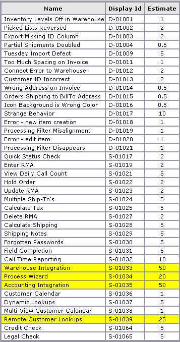
Color indicators allow the user to define their own threshold for comparing a value at a particular row with all other values in that column. When enabling visualization on a particular column, a color slider appears in the column header for setting the threshold. The color spectrum is determined by how much the data values in the column deviate from the specified threshold. Choose to visualize each cell value as a colored shape - bar, circle or square - or shade the entire cell background. Additionally, the numeric data value can be displayed adjacent to the visualization. Following is an example of visualization.
To add a visualization affect:
- Click
to add a visualization effect for a specific column. The Visualization Options dialog will be displayed.
- Choose a style from the Visualization Style drop-down menu.
- Change the Show Data Values option as desired. Default setting is Yes.
- Choose an aggregate function from the drop-down menu.
- Click OK to add the summary value and return to the Column Configuration interface.
Note: The icon indicates that a visualization exists for that particular column.
To modify or remove a visualization effect:
- Click the
icon associated to the column with an existing visualization.
- From the Visualization Options dialog,
a. If modifying a visualization affect, modify the settings as desired.
b. If removing a visualization affect, select "(none)" as a Style.
-
Click OK to save the modifications and return to the Column Configuration interface.
The Width option offer the ability to customize the width of each column, thereby improve the appearance of the report when it is rendered in the webpage and when exported (e.g., Word, PDF). By default, a column's Width value is left blank to allow the application the option to automatically determine the appropriate width based on:
- All columns in the report
- The context in each column
- The available webpage space
- The page size and orientation
When customizing a column's width, it is important to determine the scale by which an entered value will be measured. The scale of measured can be either pixels or percent where:
- Pixel is a single point of picture data displayed on the monitor. Hundreds of pixels can be used to display a very small image.
- Percentage is a fraction of the screen space allocated for each column.
To modify a column's width:
- OPTIONAL: Determine the scale type to use for the entire tabular report. To toggle the scale of a column, click on the label to the right on the width field where px equates to pixel and % equates to percentage.
- Input or modify the column's Width value.
Notes:
-
When specifying a tabular report's column's widths in pixels, keep in mind the average monitor resolution settings of the end-users viewing the report.
-
When specifying a tabular report's column's widths in percentages, keep in mind that:
a. The sum total of the percentage values must not exceed 100%.
b. The application will use whatever percentage has not been allocated to columns for the columns without a value.
The Alignment option adjusts the position of values in columns. In the following figure, numerical values are now centered in the Quantity column.
The Style option offers the ability to apply conditional formatting to a column's cell based on a specific value or another column's value. Users must create the condition and specify the formatting style. When more than one condition is specified, the application will apply the style associated to the first condition that is satisfied. Conditions are evaluated when the report is run.
Users can optionally apply the specified conditional formatting to all data columns by checking the appropriate check box.

A conditional style takes the form of an equation similar to:
Label is Compared to Value
or
Label is Compared to Column
where Label represents a column name, Compared to represents a comparison operator, Value represents a threshold, and Column represents another data column.
The available comparison operators are:
- Equal to
- Not equal to
- Less than
- Greater than
- Less than or equal to
- Greater than or equal to
- Starts with 1
- Does not start with 1
- Ends with 1
- Does not end with 1
- Contains 1
- Does not contain 1
- Between
- Not between
Notes:
-
These operators are only available for data type of type String or Text.
-
The operators available are dependent upon the column's data type.
To add a conditional Style:
- Click
or
to access the Condition Styles dialog. In the figure below two styles have been added and the Add a Condition panel opened to show the various options in the dialog.
- Click the Add a Condition button. In the panel are the Column, Operator, Value and Style attributes.
- Choose a Column from the drop-down menu to base the conditional styling on.
- Choose a comparison Operator from the drop-down menu.
- From the Value type drop-down menu, choose either Specific Value, Pre-defined Date, or Other Data Column.
- Specify a threshold Value. If a Value type of:
a. Specific Value was selected, then type in a value or click the icon to view and select a valid value from the database.
b. Pre-defined Date was selected, select a token (i.e., Today).
c. Other Data Column was selected, select a column from the drop-down list.
- Choose a Style from the drop-down list.
- Click OK to add the styling condition.
- Add more parameters by clicking Add a Condition and repeating the steps above.
- OPTIONAL: As styles are applied based on the first condition that is satisfied, move a condition up or down in the list by clicking the
or
icon respectively.
- OPTIONAL: Enable Add this style to all columns to apply the Style to all columns of a row in the table.
- Click OK to save the styling condition(s) and return to the Column Configuration interface.
Notes:
-
Pre-defined dates get evaluated at the time the report runs.
-
If the value is a number, the value field must contain a valid number to complete the comparison.
-
The
icon indicates that a least one conditional style exists for that particular column.
To modify or remove a conditional Style:
- Click the
icon to access the Style Details panel for a specific column.
- From the Style Details panel:
a. If modifying a Style, click the icon associated to a specific Style's condition. Modify the conditions as desired and then click OK to save the condition.
b. If removing a Style, click the icon associated to a specific Style's condition.
c. OPTIONAL: Enable/Disable Add this style to all columns to apply/remove the Style to/from all columns in the table.
- Click OK to save the modifications and return to the Column Configuration interface.
From the Column Configuration page, a new column may be added to the data table by clicking on the Add Custom Column button. Columns created in this manner may reference previously defined summary information.
: If a data table contains a calculated column, the configuration grid will display an Actions column. Clicking on the icon allows the column to be edited.