Creating a Pie or Ring Chart
You can view the contribution of attribute elements or metrics to a total by displaying your data in a pie or ring chart.
You can use a variety of display styles to produce pie and ring charts. You can display pie charts in a grid layout or display ring charts in scatter layout.
To Create a Pie or Ring Chart
- Open a dashboard.
- In the top toolbar, click Visualization
 .
. - Choose Pie > Pie Chart
 or Ring Chart
  .
. - In the Datasets panel, double-click attributes and metrics to add them to the visualization. A pie or ring chart requires at least one attribute and one metric.
Example Pie and Ring Charts
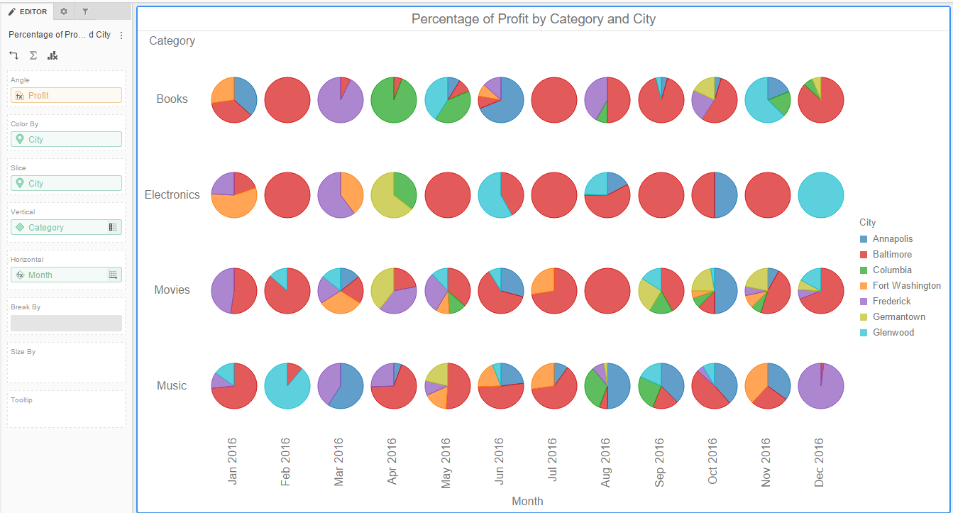
Display pie or ring charts in a grid layout. The pies or rings do not overlap.
This style requires:
- One metric in each of the following areas: Angle
- One attribute in each of the following areas: Color By, Slice, Vertical, and Horizontal
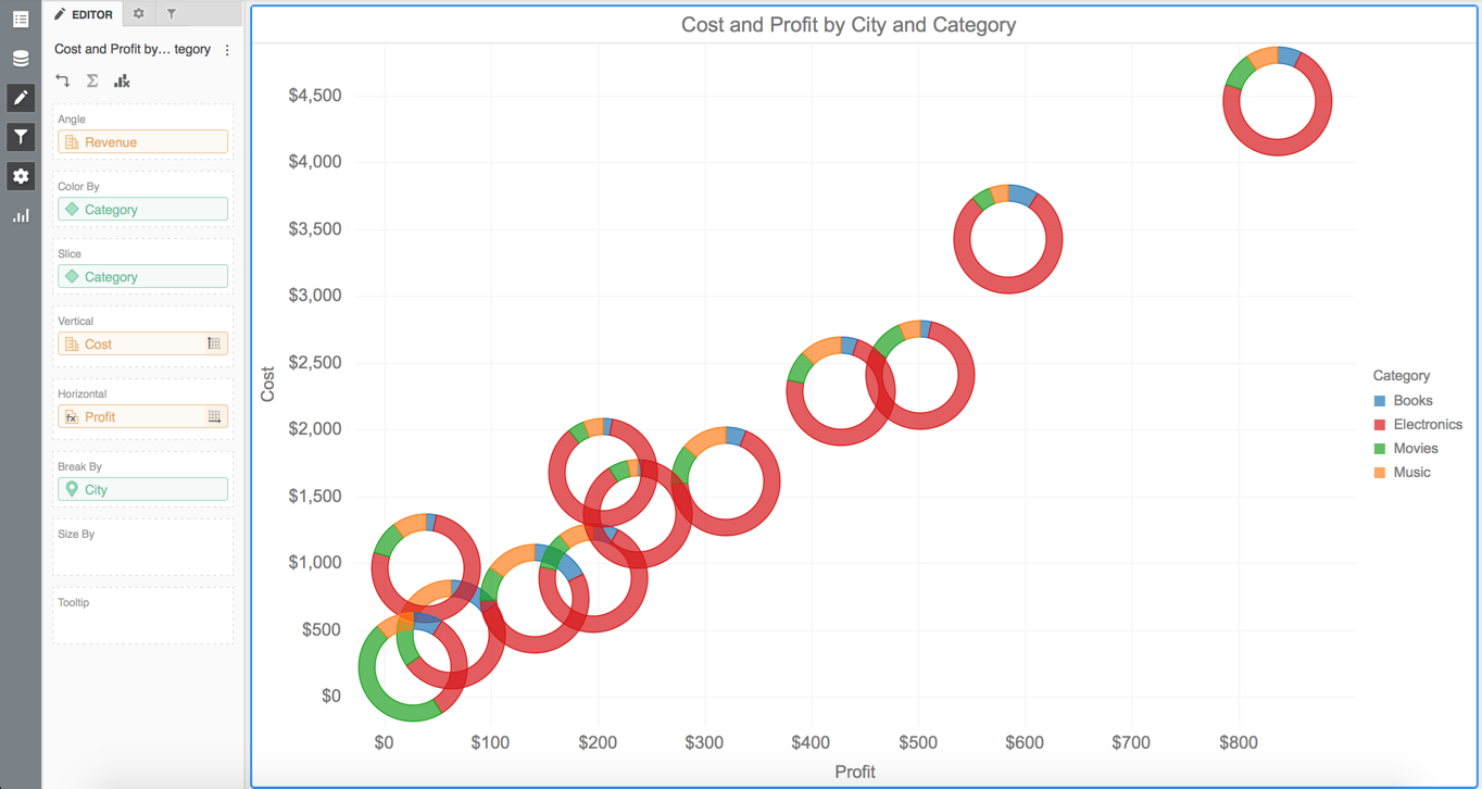
Display pie or ring charts in a scatter chart layout. The pies or rings can overlap and may or not be sized.
This style requires:
- One metric in each of the following areas: Angle, Vertical, and Horizontal
- One attribute in each of the following areas: Color By, Slice, and Break By