What is a Dashboard?
A dashboard is a visual representation of data that presents the data in a summarized format, making it easier to monitor trends and track performance at a glance. It provides a quick overview of KPIs, metrics, and other relevant information to help you make informed decisions.
The users who can edit a Custom, Published dashboard are those users with any of these roles: account-admin, account-analytics-author, account-application-admin. Users with just account-user role can only view existing dashboards.
For the full breakdown of analytics permissions by role, see User Roles and Permissions.
Key Concepts
Out-of-the-box dashboard: An out-of-the-box dashboard is a pre-built or ready-to-use dashboard that comes with your product. These dashboards provide you with immediate access to key metrics, visualizations, and insights without requiring extensive customization. These dashboards are typically built using best practices and industry standards, incorporating commonly used metrics and visualizations.
Custom dashboard: You can copy an out-of-the-box dashboard and customize it based on your requirements and preferences. It offers flexibility and customization, allowing you to choose the metrics, visualizations, and layouts that best suit your needs.
KPI: Displays important metrics that represent the performance of the system or the process. Here is an example KPI.

Panel: It refers to a container or a section within the dashboard layout where visualizations, widgets, or other dashboard elements are placed. You can use the panel to visualize various aspects of your data, such as KPIs, trends, comparisons, or detailed reports. You can use the panel as a chart or grid. The chart is a graphical representation of data that conveys trends, patterns, and insights. The chart types are bar, line, pie, scatter plot, and heatmap. Grid is a tabular representation of data, organized in rows and columns. Here is an example panel.
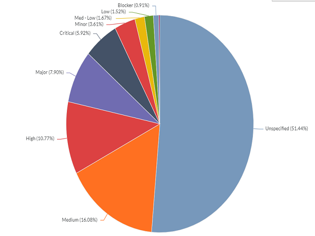
Here is an example chart.
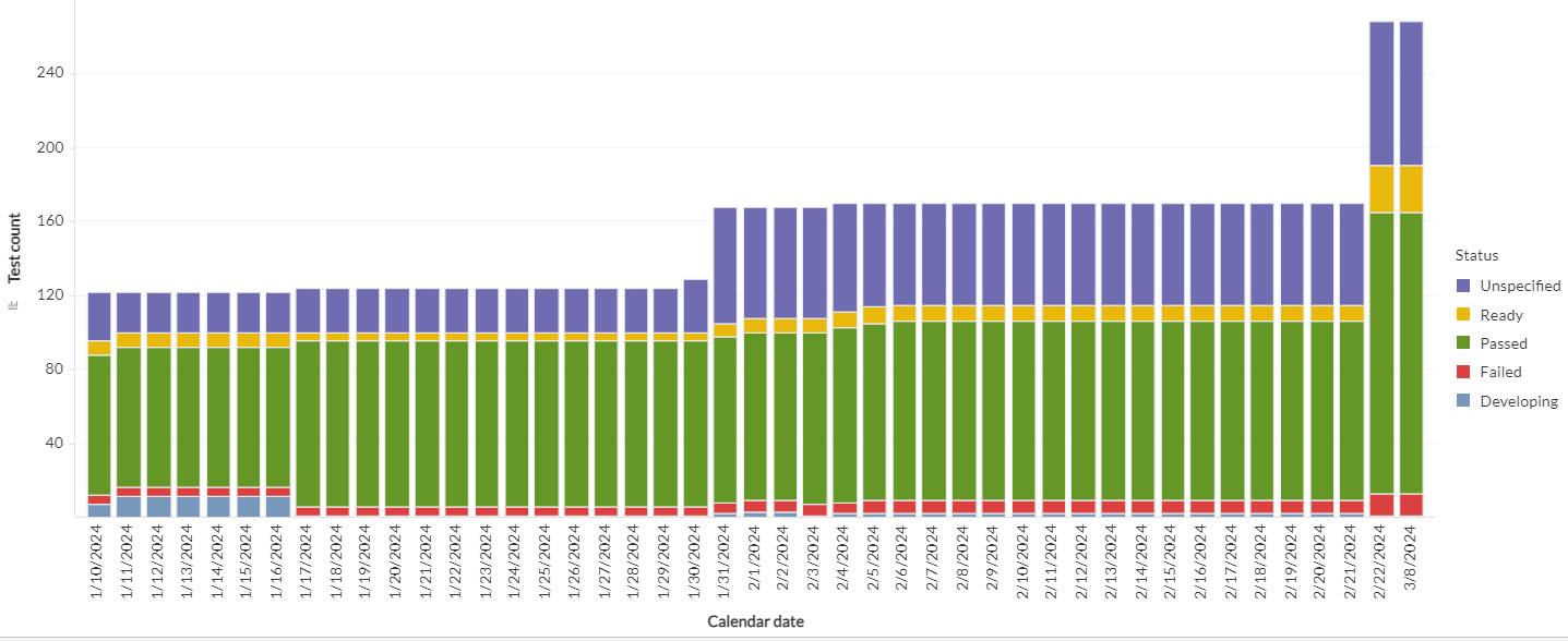
Here is an example grid.

Visualization: A visualization is a visual representation of the data in a dashboard, such as a grid, line chart, or heat map. Visualizations provide a variety of ways for you to display and interact with the data in a dashboard. You can explore the relationships between data elements by creating a network visualization, or create visually striking graphs that summarize key business indicators in a clear, easy-to-understand format. Each visualization can include data from multiple datasets at once. Each panel or chapter in a dashboard can contain multiple visualizations.
You can add the following visualization to a dashboard:
Tab: It refers to a navigational element that allows you to switch between different sections or views within the dashboard. You can use tabs to view multiple sets of related content or analyses in a single dashboard. Here is an example tab.

Filter: Filters in a dashboard serve as a tool to selectively control the data presented in visualizations and other dashboard elements. You can refine your analysis by setting specific criteria or conditions that the data must meet. Each filter allows you to focus on different aspects of the data, enabling comparisons across panels based on various parameters. Additionally, cascading filters enhance usability by dynamically adjusting the filter values based on the selection made in a dashboard. For example, selecting a value in one filter triggers other filters to display related values, facilitating a more streamlined and targeted analysis process. Here is an example filter.

Chapter: Chapters provide a hierarchical structure for organizing the content of the dashboard. They help break down large amounts of information into smaller, more manageable sections. Each chapter typically focuses on a specific topic, analysis, or set of data. This segmentation allows users to navigate directly to the sections that are most relevant to their interests or needs.
You can create layers of data in a dashboard using chapters, with each chapter displayed on a separate tab and filtered differently. Switch between chapters by selecting the corresponding tab for a chapter.
Page: Dashboards are organized into chapters and pages. Each chapter contains one or more pages. Each page can contain multiple visualizations and other dashboard objects such as text and images. Use the Contents panel to view the structure of chapters and pages within your dashboard, as well as navigate between them. Click on a page to open it. Click on a chapter to open the first page of that chapter.
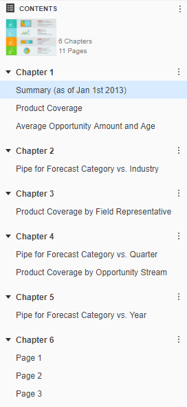
Each chapter can contain multiple pages, or layers of data, that are filtered in the same way. When a chapter contains multiple pages, a row of dots, each representing a page, appears at the bottom of the chapter. The current page is marked with a blue dot. Click one of the other dots to switch to a different page.
The structure of chapters and pages allows a dashboard to be filtered in the following ways:
- Each chapter contains its own filters that are applied across all pages and visualizations within the chapter.
- A visualization can contain its own filters, in addition to the existing chapter filters.
- A visualization can be filtered by another visualization or filter.
Dataset: It refers to a collection of data organized and stored together. Data stored in a structured format in the form of a table related to a specific domain or business process is a dataset. Each dataset contains rows and columns of data, where each row represents a record, and each column represents a data attribute or field.
Attribute: It refers to a characteristic or property of an entity or object. Attributes provide descriptive information about the entity and are stored in database tables or datasets as columns.
Attribute form: An attribute form is a descriptive category for an attribute. While most attributes have only the forms ID and Description, an attribute such as Customer can have many other forms, such as First Name, Last Name, Address, Email Address, etc.
Metric: It refers to a quantitative measure or indicator used to assess, analyze, and track the performance or behavior of a business process, system, or activity. Metric helps you measure various aspects of your organization's operations. You can make informed decisions and evaluate success in achieving specific objectives.
Here is an example attribute and metric.

Threshold: Use thresholds to format data in a visualization based on multiple attribute or metric qualifications.
Information window: Information windows allow you to include additional context that is critical to the data point without overcrowding the canvas.
Auto layout and free-form layout: In auto layout, containers automatically fill the entire canvas and can be repositioned around each other. Use free-form layout to organize and overlap the containers that contain your visualizations, filters, selectors, images, HTML, and so on. You can independently position, size, and layer containers on a page.
Outline mode: You can enable outline mode to make grid visualizations easier to analyze, expanding and collapsing attributes to display more or less detail.
Build a Dashboard Workflow
- Create the dashboard and add its data. See Build a Dashboard.
- Add visualizations. See Work with Visualizations.
- Add grids for tabular detail. See Work with Grids.
- Format the visualizations and lay out the page. See Format and Lay Out a Dashboard.
- Add text, images, and shapes. See Add Text, Images, and Shapes.
- Organize the content into chapters and pages. See Organize Chapters and Pages.
- Highlight data that meets a condition. See Apply Thresholds.
- Add filters and interactivity. See Add Filters and Interactivity.
- Save, publish, and manage the dashboard. See Save, Publish, and Manage a Dashboard.
For the field-level detail in the Show Data dialog and the Advanced Thresholds Editor, see Dashboard Editor Reference.
Before you build, review the dataset, chapter, page, and derived metric limits in Recommendations for Custom Dashboards.