Work with Visualizations
This page covers creating each type of visualization, then changing, duplicating, moving, and deleting the visualizations you've added. It's step 2 of the Build a Dashboard Workflow.
For what a visualization is and how it fits into a dashboard, see Key Concepts. For grid visualizations, see Work with Grids.
Create a Visualization
Each visualization type has its own menu path and its own data requirements.
Create a Bar Chart
- Open a dashboard.
- In the top toolbar, click Visualization
 .
. - Choose Bar and one of the many bar chart options. A bar chart requires at least one attribute and one metric.
- In the Datasets panel, double-click attributes and metrics to add them to the visualization.
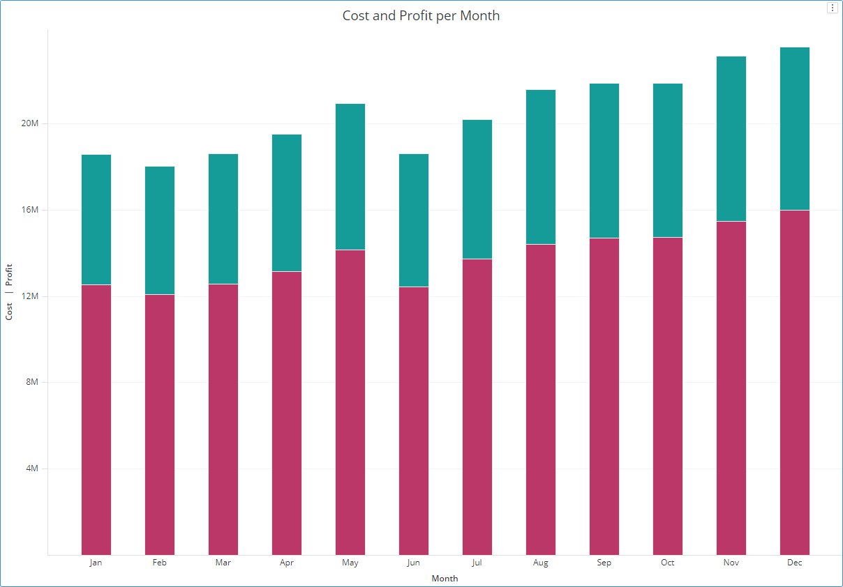
Example Vertical Stacked Bar Chart
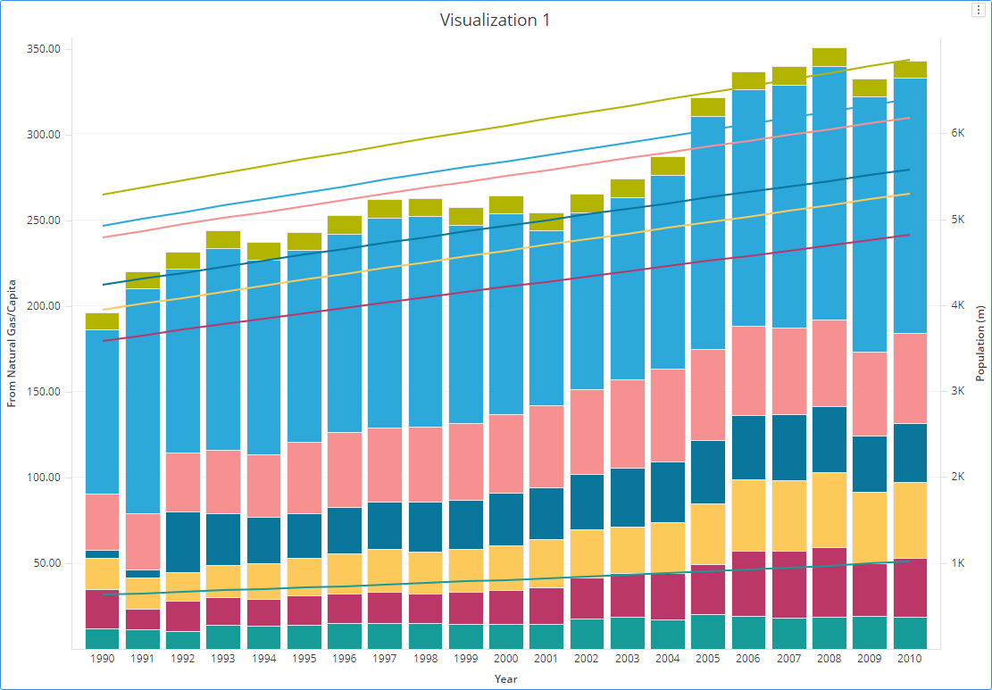
Example Combo Chart
Create a Line Chart
- Open a dashboard.
- In the top toolbar, click Visualization .
- Choose Line and one of the many line chart options.
- In the Datasets panel, double-click attributes and metrics to add them to the visualization. A line chart requires at least one attribute and one metric. Time attributes are recommended for line charts and dual axis line charts.
Example Line Chart
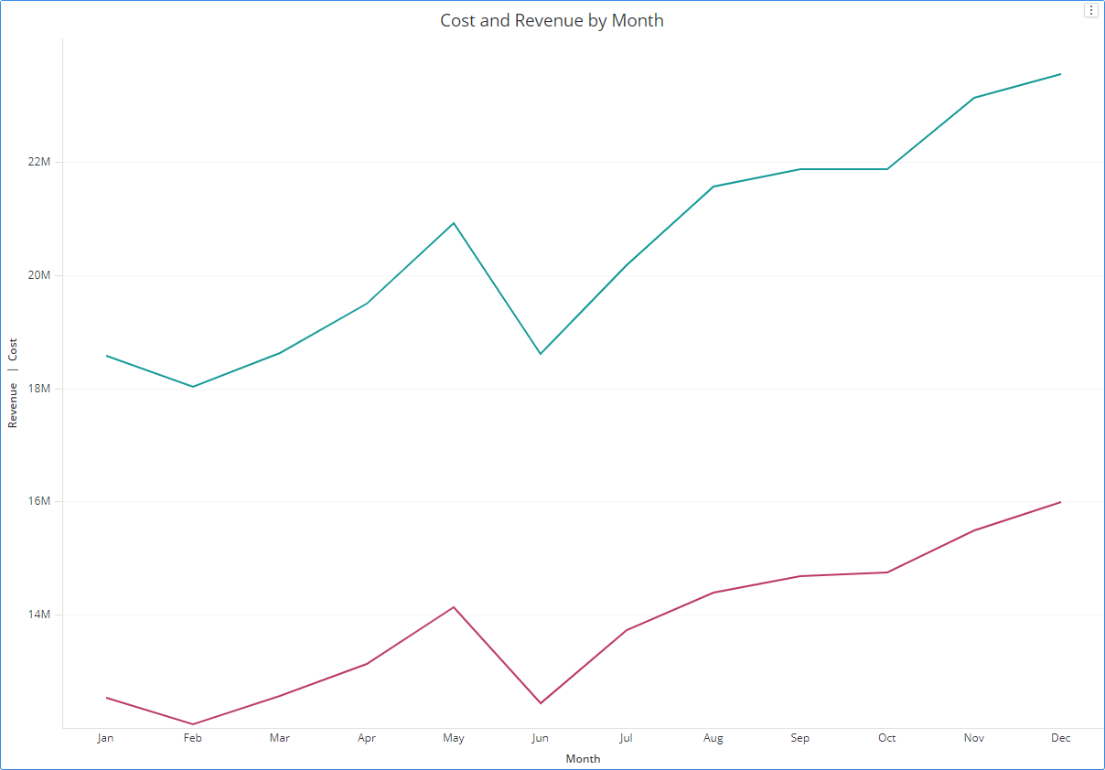
Example Combo Chart
Create a Pie or Ring Chart
You can view the contribution of attribute elements or metrics to a total by displaying your data in a pie or ring chart.
You can use a variety of display styles to produce pie and ring charts. You can display pie charts in a grid layout or display ring charts in scatter layout.
- Open a dashboard.
- In the top toolbar, click Visualization .
- Choose Pie > Pie Chart
 or Ring Chart
  .
. - In the Datasets panel, double-click attributes and metrics to add them to the visualization. A pie or ring chart requires at least one attribute and one metric.
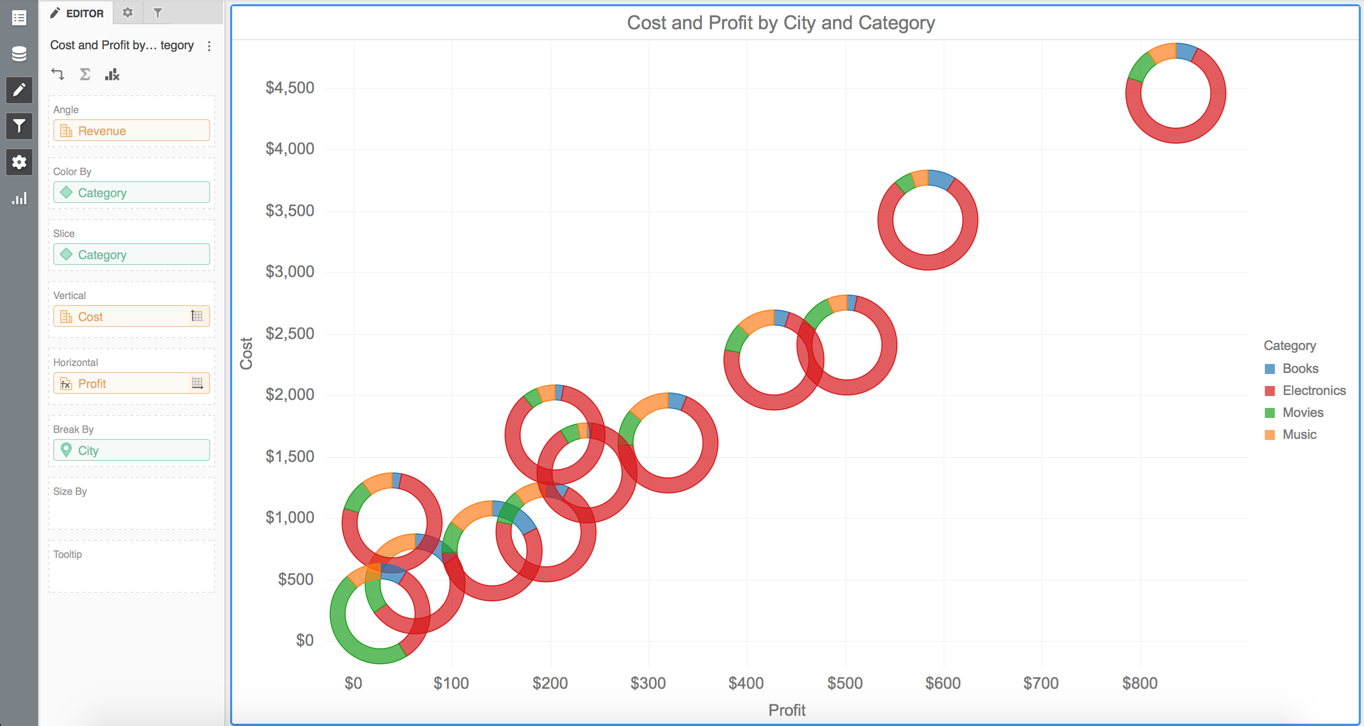
Example Pie and Ring Charts
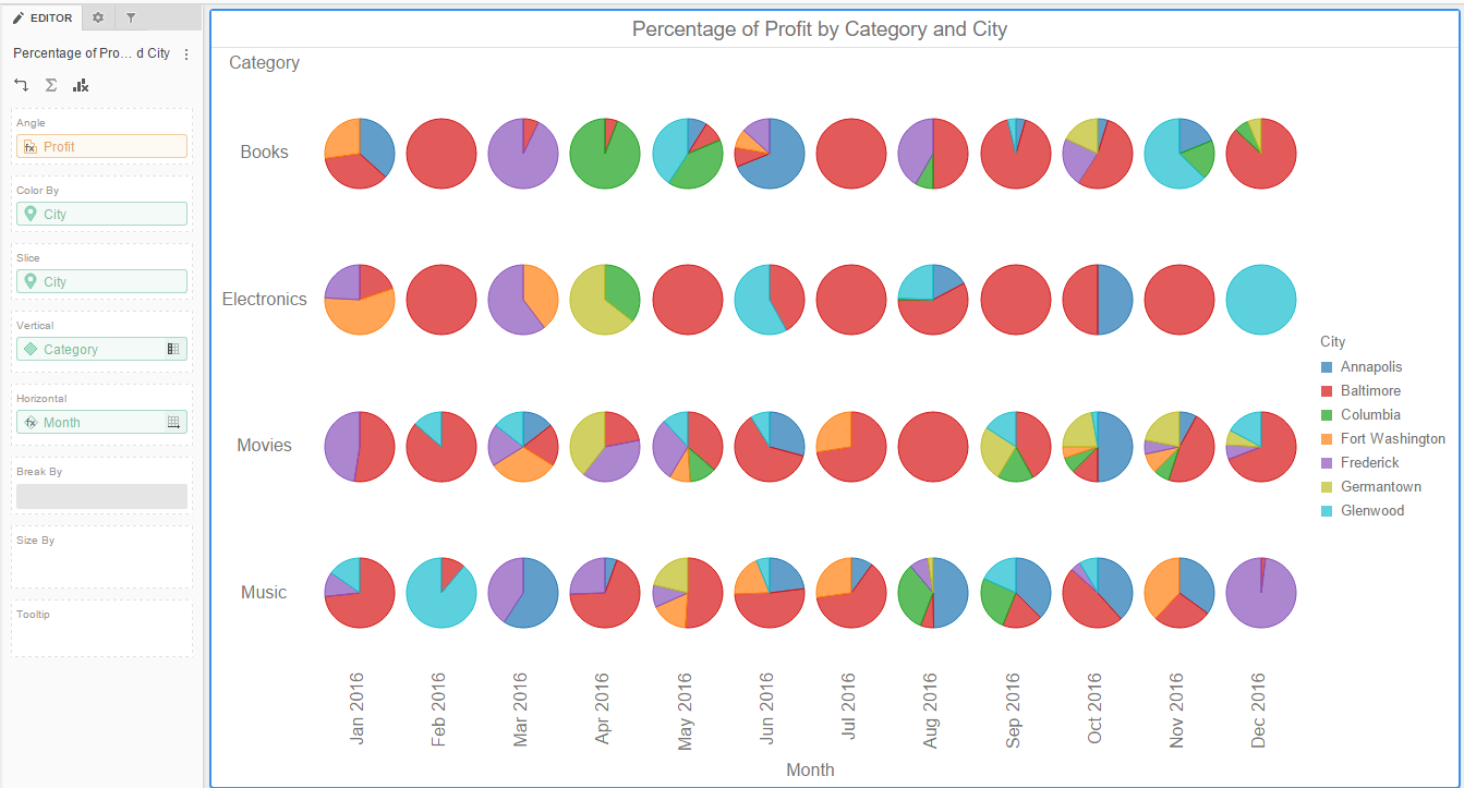
Display pie or ring charts in a grid layout. The pies or rings do not overlap.
This style requires:
- One metric in each of the following areas: Angle
- One attribute in each of the following areas: Color By, Slice, Vertical, and Horizontal
Display pie or ring charts in a scatter chart layout. The pies or rings can overlap and may or not be sized.
This style requires:
- One metric in each of the following areas: Angle, Vertical, and Horizontal
- One attribute in each of the following areas: Color By, Slice, and Break By
Create a Bubble Chart
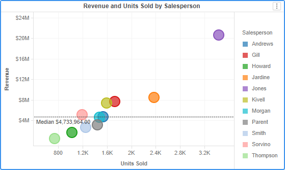
A bubble chart requires at least one attribute and one metric. The markers are not sized and do not overlap.
- Open a dashboard.
- In the top toolbar, click Visualization .
- Choose More > Bubble Chart .
- In the Datasets panel, double-click attributes and metrics to add them to the visualization.
Example Bubble Chart
Create a Heat Map
You can create a heat map visualization in a dashboard.
- Open a dashboard.
- In the top toolbar, click Visualization .
- Choose More > Heat Map
 .
. - In the Datasets panel, double-click attributes and metrics to add them to the visualization. A heat map requires at least one attribute and one metric.
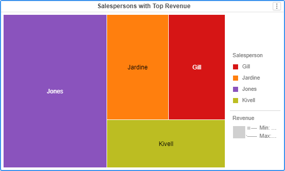
Example Heat Map
Create a Histogram
- Open a dashboard.
- In the top toolbar, click Visualization .
- Choose More > Histogram
 .
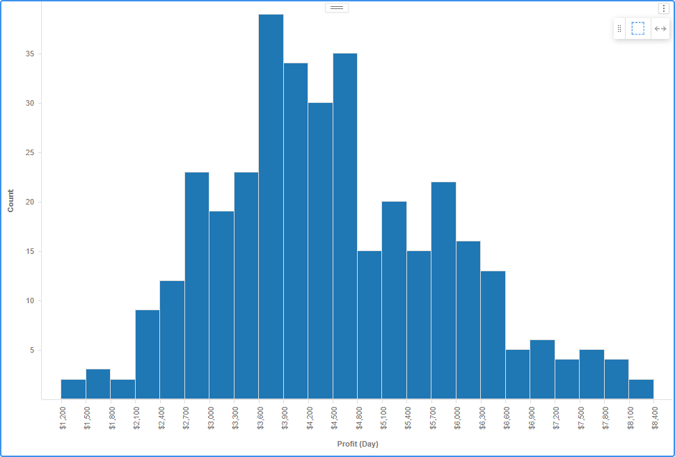
. - In the Datasets panel, double-click attributes and metrics to add them to the visualization. A histogram requires at least one attribute and one metric.
- Open the Format panel to modify formatting options, specific to histograms.
Histogram Example
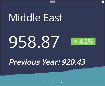
Create a KPI Visualization
- Open a dashboard.
- In the top toolbar, click Visualization .
- Choose KPI > KPI
 .
. - In the Datasets panel, double-click attributes and metrics to add them to the visualization. A KPI visualization requires at least one attribute and one metric.
- Open the Format panel to select formatting options, specific to KPI visualizations.
KPI Example
Create a Network Visualization
You can create a network visualization in a dashboard.
- Open a dashboard.
- In the top toolbar, click Visualization .
- Choose More > Network
 .
. - In the Datasets panel, double-click attributes and metrics to add them to the visualization. A network visualization requires at least two attributes and one metric.
Change the Visualization Type
After you have added a visualization to a dashboard, you can quickly change the type of visualization used to display your data. Follow these steps to change the visualization's display type:
-
Open an existing dashboard.
-
Select the visualization you need to change.
-
In the top toolbar, click Visualization
. -
In the Visualization Gallery, click the icon that corresponds with the new visualization type.
Note: Hover over the icons to view the name and data requirements for each visualization type.
-
You can customize the display of the visualization by adding, replacing, and removing attributes and metrics from the visualization.
Duplicate a Visualization
You can create a new visualization by duplicating an existing visualization, and then modifying it. When you duplicate an existing visualization, you can add it to any page or chapter in your dashboard.
- Open an existing dashboard.
- Click More
 in the title bar of the visualization you want to duplicate and choose Duplicate.
Move a Visualization
After you create a visualization in a dashboard, you can change the position of the visualization within the dashboard. You can move a visualization:
-
To a different position within the same page
To move the visualization, click and drag the visualization to its new location in the dashboard. An indicator line appears in the location where you can add the visualization. Release the mouse button to place the visualization in the new location.
-
To a different page
- Click More in the title bar of the visualization you want to move.
- Click Move to and select the appropriate page.
- Click More
-
To a different chapter
Note: Moving a visualization between chapters leads to clearing all filters.
- Click More in the title bar of the visualization you want to move.
- Click Move to and select the appropriate chapter.
- Click More
For how chapters and pages are structured, see What is a Dashboard?. To add or rearrange them, see Organize Chapters and Pages.
Delete a Visualization
To Delete a visualization from a dashboard, perform these steps:
- Open an existing dashboard.
- Click More in the title bar of the visualization you want to delete and choose Delete.
Select Which Attribute Forms Appear
You can choose which attribute forms appear for a specific attribute. An attribute is a business concept, such as Region or Income Bracket, that provides a label for the numerical data (that is, metrics) in your dashboard. An attribute form is a descriptive category for an attribute. While most attributes have only the forms ID and Description, an attribute such as Customer can have many other forms, such as First Name, Last Name, Address, Email Address, etc.
Selecting which attribute forms to display is helpful when you are working with attributes containing geographic information. You can select whether to display the latitude and longitude information for an attribute, when that information is stored in separate attribute forms.
You can also determine what attribute information appears in the attribute and attribute form headers in the visualization.
Note: You can choose to have a header containing the attribute form name automatically display above each attribute form shown in a grid, or have a single header display for each attribute in a grid, with each header containing only the attribute name.
-
Open a dashboard.
-
Click on the visualization in which you want to display attribute forms and select the required attributes.
-
In the Editor panel, right-click the attribute for which you want to display attribute forms and choose Display Attribute Forms.
-
To display an attribute form in the visualization, select the corresponding checkbox.
-
To hide an attribute form in the visualization, clear the corresponding checkbox.
-
Select a value from the Display Attribute Form Names drop-down list:
Value What it displays Off (default) Automatically displays the attribute's name. No attribute form name appears for the attribute. On Automatically displays the attribute's name, as well as the selected attribute form names. Form name only If your visualization is a grid, automatically displays a single header for each selected attribute form. Show attribute name once If your visualization is a grid, displays a header for each attribute form and includes the attribute name only in the header for the first attribute form for each attribute. The remaining attribute forms display with only the attribute form name. Automatic If your visualization is a grid, displays either headers for each attribute or attribute form, depending on the number of attribute forms visible in the grid for each attribute. If only one attribute form appears in the grid for an attribute, the attribute appears with a header containing the attribute's name. If more than one of the attribute's forms are visible in the grid, each attribute form appears with a header containing the attribute name, followed by the attribute form name. -
Click OK.
Enable a Legend
A legend in a data visualization, is a guide that clarifies the meaning of colors, symbols, or patterns in a chart or graph, helping users interpret the data accurately.
Note: Only bar, line, area, scatter, and pie charts are supported.
- Open a dashboard.
- Choose your visualization type.
- In the Format panel, enable Legend.
- Drag the legend to one the following positions:
- Top/bottom: left, center, right
- Right/left: top, center, bottom
Create a Visualization from a Natural Language Query
Natural language queries enable you to quickly find insights by entering questions, rather than manually building out a visualization.
Note: Natural-language queries are only supported in English.
- Open a new or existing dashboard.
- In the toolbar, click
 .
. - A list of sample questions appears. Choose a sample question or enter a question regarding the type of data you want to view in your dashboard. You must use the correct metric and attribute names in your query. As you enter attribute and metric names, you can select matching ones from the list.
- Press Enter.
- A new visualization appears, providing the data to answer your question.
Next Step
Work with Grids — step 3 of the Build a Dashboard Workflow.