Format and Lay Out a Dashboard
This page covers the panels you use to edit and format a dashboard, and how to arrange the containers on a page. It's step 4 of the Build a Dashboard Workflow.
For what a panel is and how it fits into a dashboard, see Key Concepts.
View and Hide Panels
You can view and hide the panels used for editing, filtering, and formatting visualizations within a dashboard.
Click View in the title bar to show or hide the corresponding panels. The selected panel indicates the corresponding panel is open.
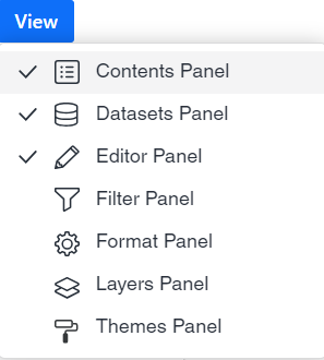
Several procedures in this feature area begin by opening a panel this way.
Use the Editor Panel
The Editor panel contains a list of all the attributes and metrics that appear as data in the selected visualization. To view the dataset objects for a specific visualization, click the visualization in the dashboard.
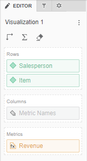
Access
- Open an existing dashboard that contains the visualization you want to edit.
- Select the visualization in the dashboard.
- Click View and then select Editor Panel.
- To add data to your visualization, drag attributes or metrics from the Datasets panel to the Editor panel. A blue indicator line appears in the area to which you add the attribute or metric.
Use the Format Panel
There are multiple formatting options for a visualizations. You can choose the font, background color, and borders for each part of the visualization, such as the column headers, row headers, values, container, and title. You can define the padding, column height, row height, whether to merge row and column headers, and so on.
- Click on the grid visualization you want to format. If necessary, you can select a specific object in the visualization for formatting.
- Right-click and choose Format. If you selected a specific object in the visualization, a pop-up menu displays the appropriate formatting options for that object. In addition, the Format panel automatically updates the first drop-down list with the area of the visualization you are formatting and the corresponding format options appear.
- Select the appropriate options to format the visualization.
- You can highlight data for an attribute or metric by applying formatting when the data fulfills a specific condition.
- You can apply general formatting options used for all types of visualizations, such as renaming attributes or metrics, choosing whether to display a visualization's title bar, and so on.
To highlight data based on a condition, see Apply Thresholds.
Use Free-Form Layout
Use free-form layout to organize and overlap the containers that contain your visualizations, filters, selectors, images, HTML, and so on. You can independently position, size, and layer containers on a page.
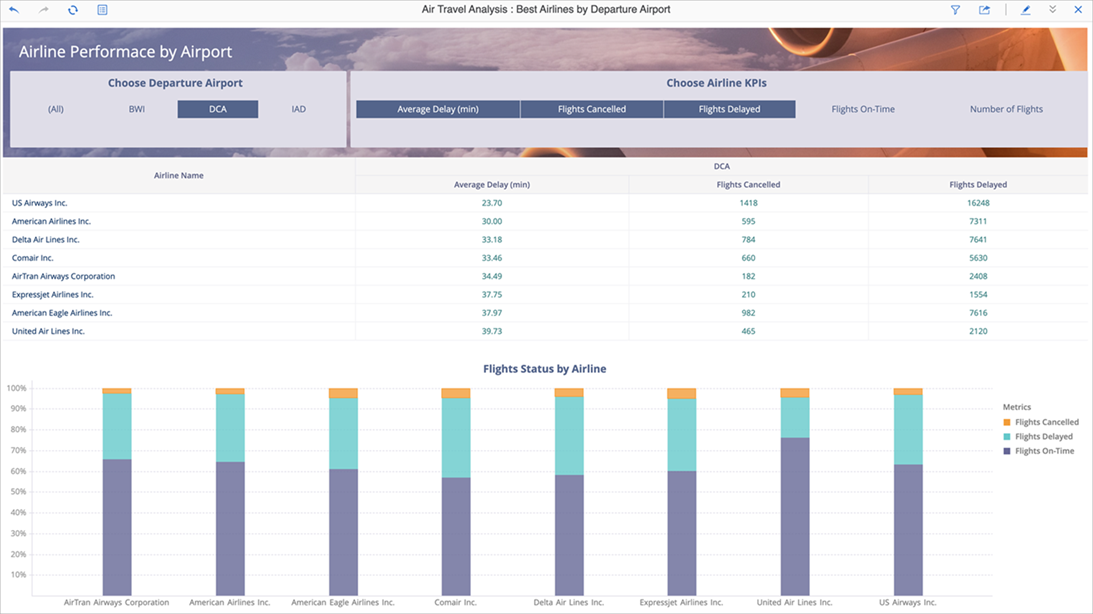
- Open or create a new dashboard. Your containers appear in auto layout by default. In auto layout, containers automatically fill the entire canvas and can be repositioned around each other.
- Open the page in which you want to use free-form layout.
- Click Convert to Free-form Layout
 .
. - You can revert back to auto layout by clicking the same button. When reverting back to auto layout, it is possible that your dashboard may not look exactly the same as it did before you converted it. If necessary, you can undo your change to revert back to free-form layout.
Next Step
Add Text, Images, and Shapes — step 5 of the Build a Dashboard Workflow.